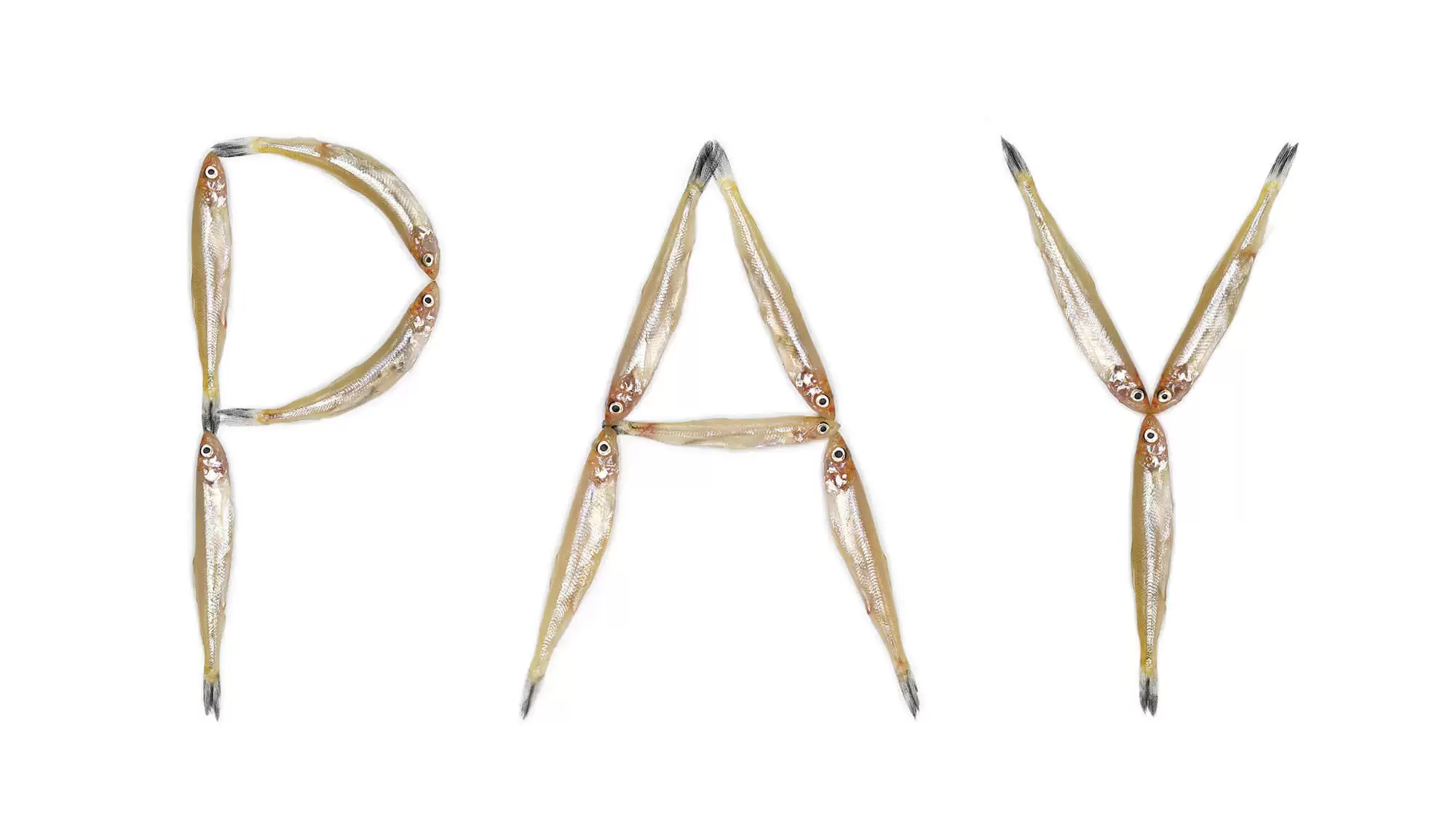
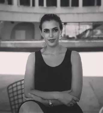
Monique Goossens sees possibility in the shapes and functionalities of unconventional materials. The Amsterdam artist is fascinated with tactility, relishing in the softness, texture, and fluidity of a sensation. She lets that fascination flow into her artistic vision of otherwise alienated objects and concepts, allowing for an openness in how she perceives netting, plastic, frogspawn, fish, birds, rats, or hair—all materials she incorporates into her typographic and photographic work.
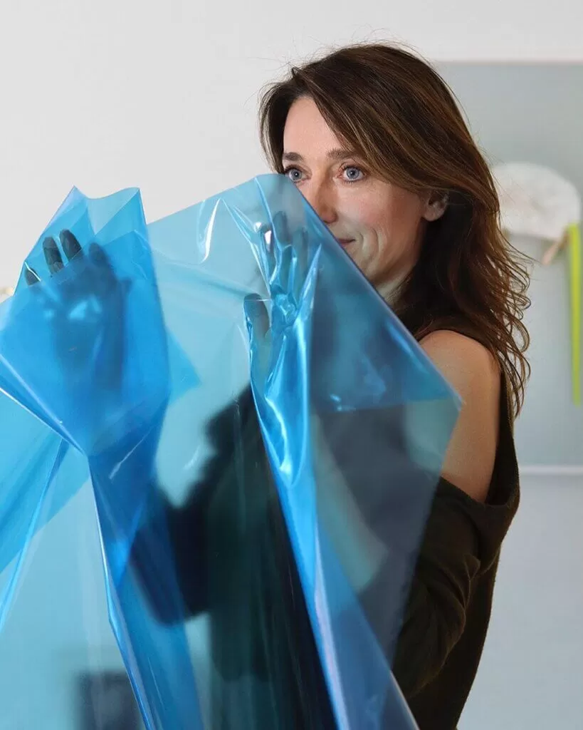
I find inspiration in materials, nature, animals, colors, human body, objects, and the possibility to translate them into a new contemporary aesthetic form.
Monique Goossens
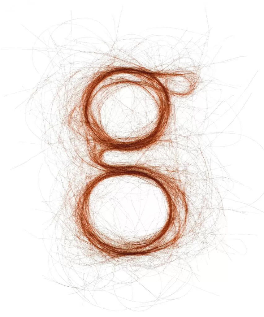
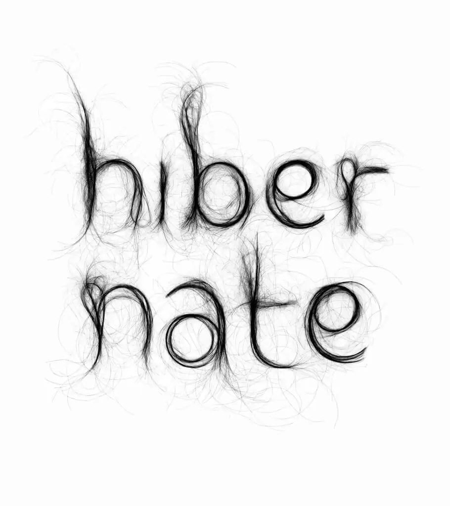
Some of her most arresting work involves human hair spun in rays or fine “strokes” resembling that of a pen, sometimes in letters, sometimes in rings. Hair is intimate and characteristic, much like typography. It’s also a medium that is rendered unsettling when it is removed from the human body; it reminds us of the macabre, of framed Victorian lockets and even the occult.
Within the context of typography, Goossens indirectly questions our discomfort and curious whimsy. After all, hair has been repurposed and used in art-making for centuries. Typeface, however, is arguably more conceptual and less “of the earth” than these other wholly natural materials presented in her work.
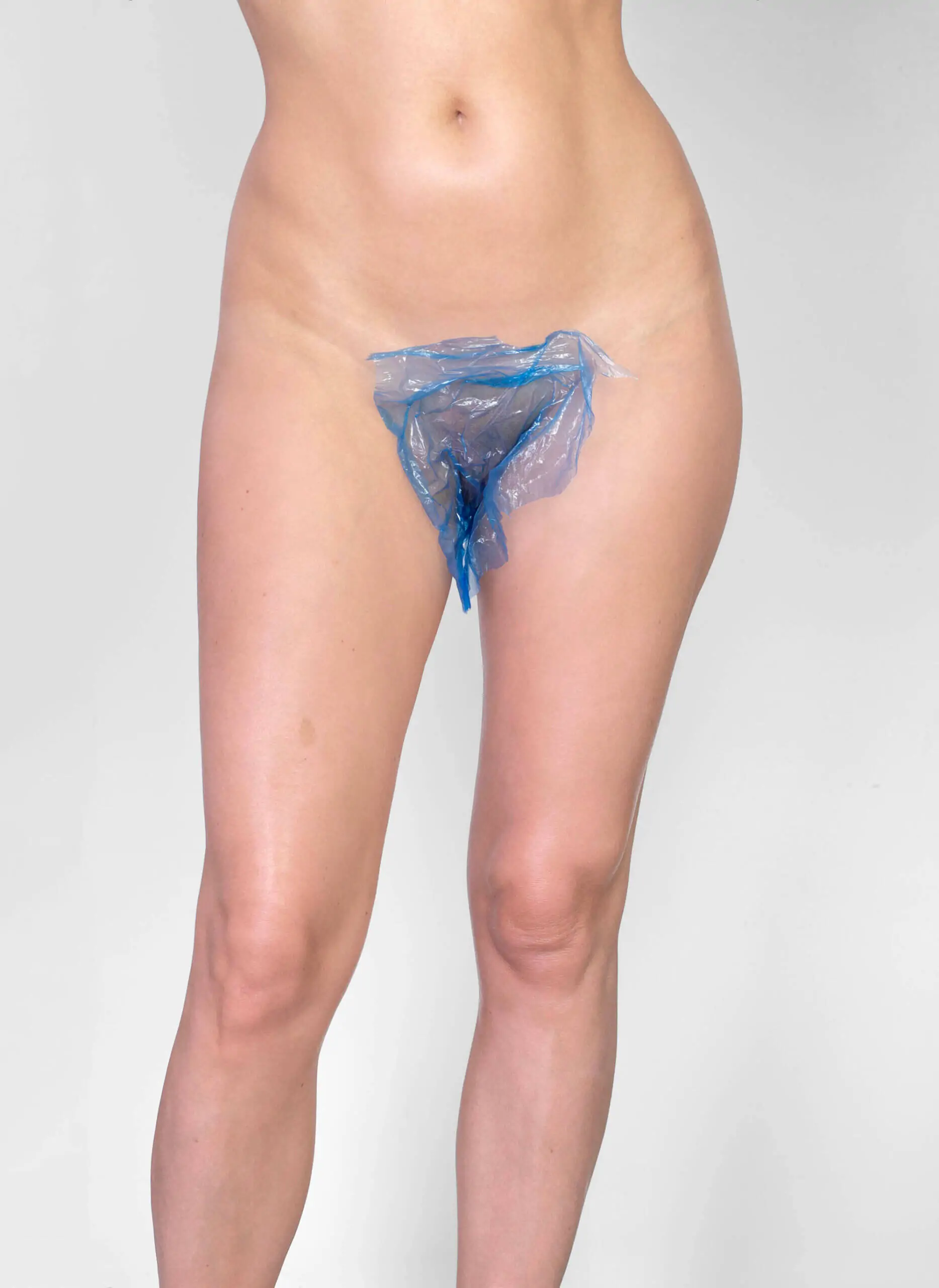
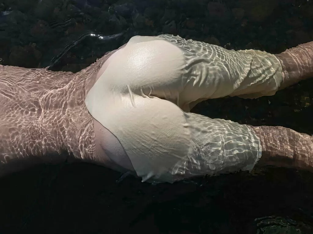
As the artist herself points out, the natural and unnatural—the latter being man-made and perceived as intangible—converge in her practice to create mimicry between the body and its external counterpart, as evidenced in Goossens’ the feeling on my skin series. The ecological and sensual juxtapositions are there, with Goossens layering multiple “skins” to delight in her own love for the sensations they create.
Q: What does your creative process look like? Where does it begin for you?
Monique Goossens: Everything can inspire me. Ideas come often naturally when I see an interesting material. I find inspiration in materials, nature, animals, colors, human body, objects, and the possibility to translate them into a new contemporary aesthetic form. My work process and inspiration never stops because it’s a way of looking. I see the beauty in many things and all kinds of unusual materials. I work very intuitively and have no concrete goals in mind. The essence is, however, always materials and alienation.


Q: What ignited your interest in experimental typography?
Monique Goossens: In my work, material, and material research are the most important. I want to use these materials in universally recognizable shapes, that is why I chose typography. But also the human body, chairs and animals. This is alienating and it often contains a contrast between natural and unnatural. For example, typography made of animals or human hair.
Q: What is the significance of using hair as a medium? What kind of hair do you use?
Monique Goossens: I use human hair in my work. When you use hair in a different way, the result is very interesting. It can be surprising and confusing or give an object a human touch.
Q: You also use waste, plastic, netting, and even wildlife in your photography and typography. Why is the natural world important to your work?
Monique Goossens: Much of my work is about skin in the broadest sense of the word. For example, the feeling of a material on my skin, layers, transparency, animal skin, hair, a layer of a material on skin, concealing or revealing skin, the squeezing of skin.
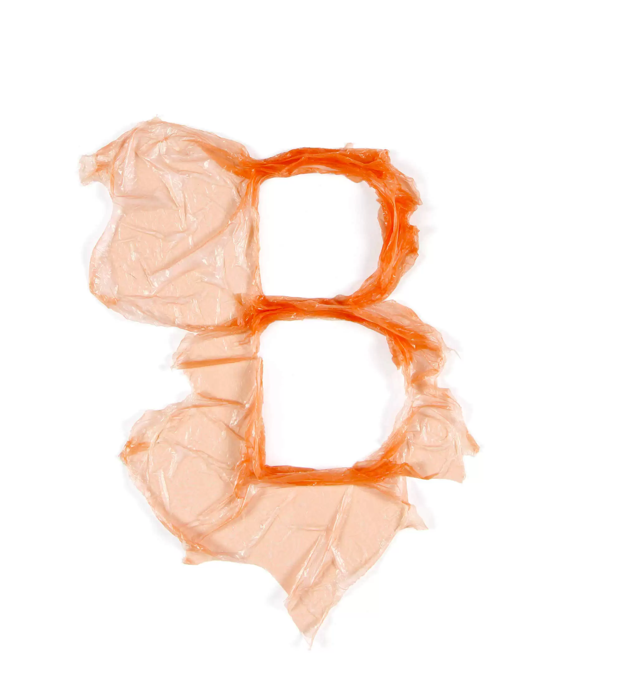
Because of this you see animals, animal skin and the human body in my work. I work with contrast and alienation and nature lends itself particularly well to this. The plastic in my plastic typography looks like skin to me. When I use waste in my work it’s because I love the worn-out material and I can see the beauty in it.
Q: How do you go about incorporating animals into your photography and typography?
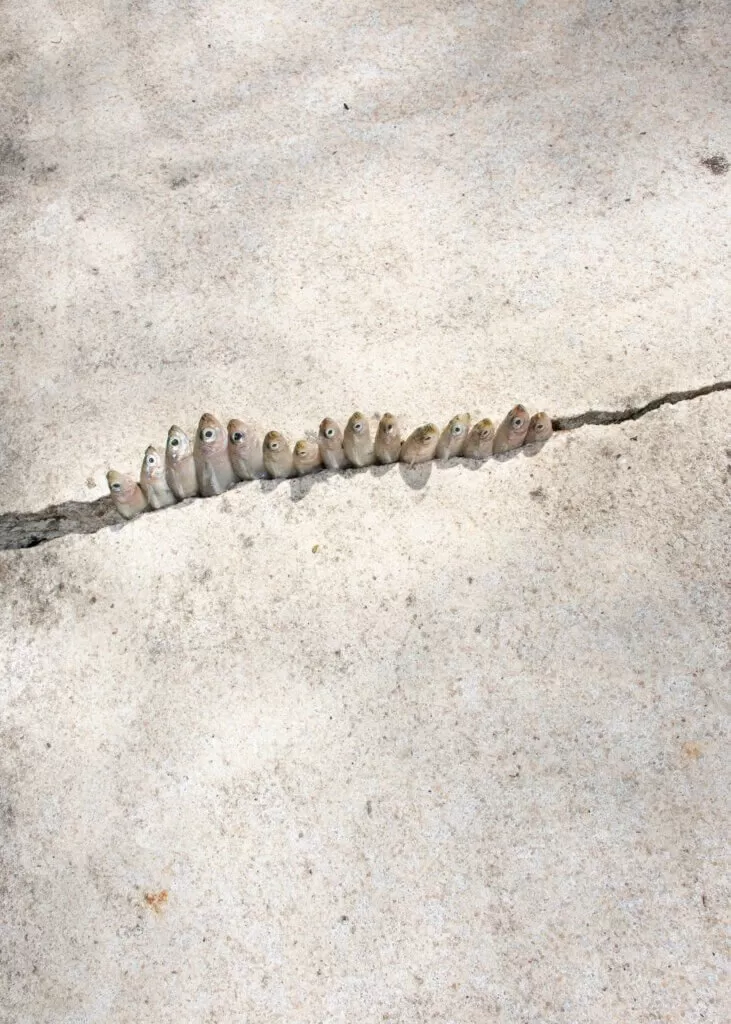
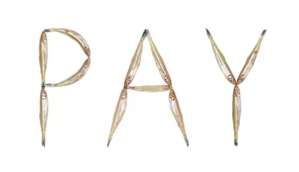
Monique Goossens: All the animals in my work died of natural causes and I work with animals that have fascinating elements. The soft fur of a rabbit for example or the shiny slippery texture of fish. They come to me in a natural way. When I was at a fish market I saw small fish, called ‘smelt’ lying in a curved shape.
I immediately saw a letter ‘S’ and started making the fish typography. The fish look like acrobats to me. And for the Drifting series, I created a final portrait of dead animals that still retain their beauty. And I just started another project, which I am not going to tell about, but I can disclose one work called ‘Nosy’, also made with small fish.
Q: What does the series the feeling on my skin say about your relationship between your own body and sensuality? How did the idea for that series emerge?
Monique Goossens: The feeling on my skin is about my sensual fascinations. I love how some materials feel on my skin. I used my tactile fascinations such as squeezing, bulging, smooth and slimy to concealing and revealing on my own body. This work is the most personal I’ve made so far.
Q: How do you know when a piece is finished?
Monique Goossens: When I am enthusiastic or moved in any way. If I am fascinated by the image myself, then I know it is finished.
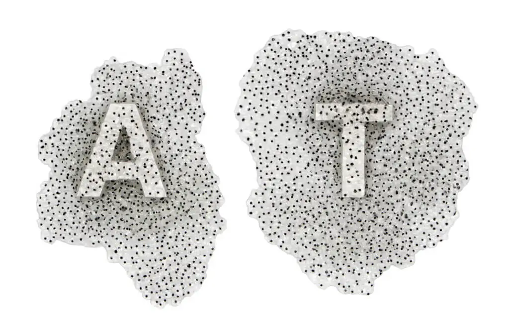
Frogspawn typography
Q: Which of your works resonate the most with you? Do you have a favourite piece or series?
Monique Goossens: Some works of the feeling on my skin resonate the most with me: soft touch and second skin. Also, my hair typography and my latest work Nosy resonate with me. The works Mouse Fluor and Bird Flower Blue are also favourites.


Q: What is the most rewarding aspect of being an artist?
Monique Goossens: Freedom in every aspect. And the satisfaction that I feel when a work is finished and I feel that it’s good.
Q: What are the most challenging aspects?
Monique Goossens: How far can I go? That’s the question. Sometimes my work is edgy. I know that there are limits, but they are mostly the limitation[s] that other people experience. I love to make work that’s on the edge. Or just over it.
Another challenge is more practical. For example, when I make nude photography in nature the weather has to be good, the light has to be soft and I need privacy.
https://www.instagram.com/monique.goossens.studio/
©2020 Monique Goossens


