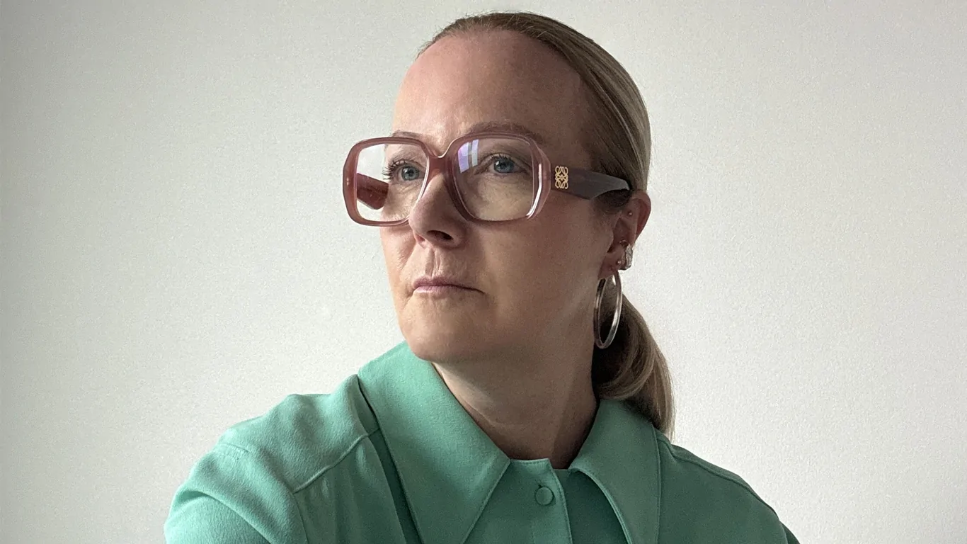
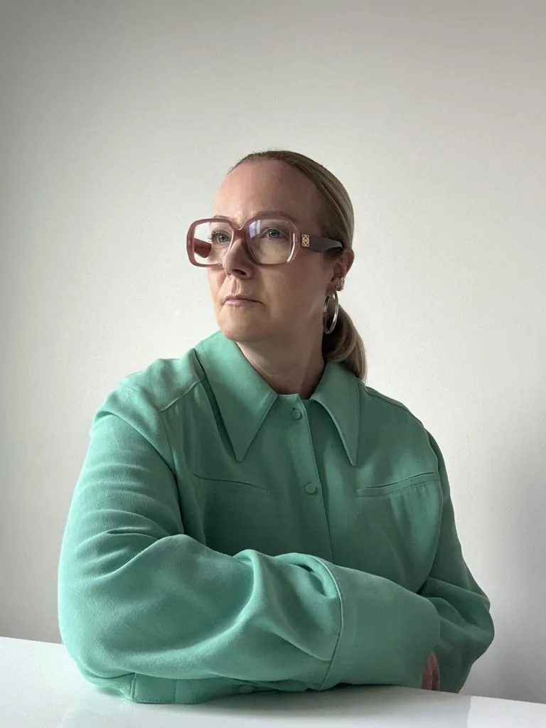
From fashion runways to public art, Jane Boddy transforms colour into an emotional language — most recently in Pantone’s vibrant Coldplay Yellow 25.
If the language of colour has a heartbeat, Jane Boddy is one of the people who can hear it. As Creative Director at the Pantone Color Institute, she doesn’t just forecast colour trends — she translates the emotional undercurrents of our time into palettes that ripple through fashion runways, living rooms and product shelves around the globe. A former fashion designer turned colour savant, Boddy has spent over two decades helping the world not only see colour, but feel it.
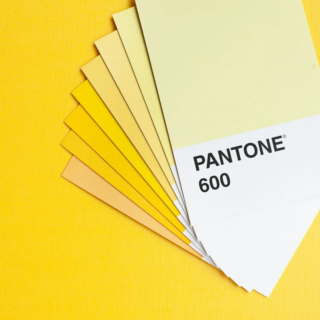
I think people often picture one single shade when they think of yellow, but it’s so much more layered than that
Jane Boddy
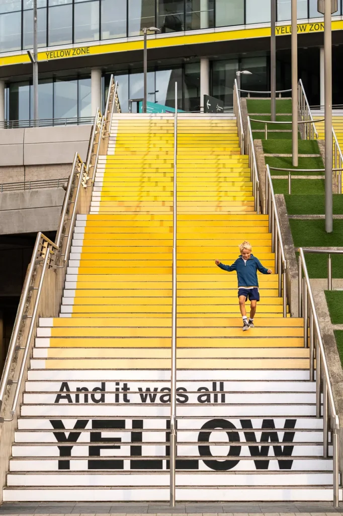
Her process is equal parts research and intuition, grounded in cultural shifts, technological advances and the psychology of perception. This sensibility came vividly to life in Pantone’s recent collaboration for Wembley Park’s Coldplay Yellow 25 project, a 58-step golden gradient celebrating the 25th anniversary of the band’s breakout hit. Boddy mapped the shifting moods of the song into brightness and saturation changes, creating an immersive artwork where, as she puts it, visitors could “experience it in a way that feels almost like stepping inside the song itself.”
“I think people often picture one single shade when they think of yellow, but it’s so much more layered than that,” she says, her voice carrying the same quiet precision as her colour choices. That layered thinking is at the core of her influence — she can parse the difference between a hue that signals optimism and one that whispers vulnerability, then package that insight into something brands and consumers can hold in their hands.
For Boddy, colour is never static. “Yellow isn’t just bright and sunny, it’s an emotionally charged colour,” she reflects, as if speaking both of pigment and of the times we live in. Boddy is a narrator fluent in light.
Yellow is often seen as sunny and optimistic. In working on the Coldplay Yellow 25 project, what did you discover about the colour that people might not expect?
Jane Boddy: I think people often picture one single shade when they think of yellow, but it’s so much more layered than that. Lighter yellows can feel gentle and uplifting, while deeper, richer yellows have a completely different kind of energy. With the Steps, I wanted people to experience that range for themselves and maybe walk away seeing colour in a more nuanced way.
Can you walk us through how you translated a piece of music into a sequence of colours for the Wembley Park steps?
Jane Boddy: I remember seeing Coldplay perform Yellow when it first came out, and what struck me most was how emotional it felt. That’s the link I wanted to make—yellow isn’t just bright and sunny, it’s an emotionally charged colour. I listened to the song many times, mapping the shifts in mood I heard in both the music and the lyrics. As the song unfolds and love is proclaimed, I translated those changes into variations in brightness and saturation. I actually found it fascinating how perfectly the colour yellow worked for the song—its positivity and warmth meant the music and colour could work together in perfect harmony.
Your career began in fashion design before moving into trend forecasting and colour direction. When did you realise colour, itself could be the centre of your work?
Jane Boddy: I actually started out as a fashion designer, and back then I didn’t even realise you could have a career that focused just on colour. When I was working with brands, my favourite part of the process was always creating the seasonal themes and then mapping the colours to them. I’d find myself spending way more time on the palettes than on the clothes themselves. I think it was the complexity of colour that really hooked me. Later, when I moved into trend forecasting and started building colour palettes for agencies, I realised I had a unique ability for it—and that’s when I decided to make colour my focus.
Pantone has been a universal language of colour since the 1960s. How does the brand stay ahead in such a fast-moving creative landscape?
Jane Boddy: We stay ahead by blending data with intuition, guided by a deep understanding of colour psychology and a huge curiosity for global culture. We don’t just identify visual trends—we explore the emotional undercurrents shaping societies around the world, ensuring our selections truly resonate.
Successful colour forecasting balances creative vision with commercial clarity, helping brands align with evolving tastes, strengthen identity, and stay culturally relevant. Every forecast is more than a shade—it’s a narrative, grounded in research, emotional insight, and market application. Our ability to weave psychology, instinct, cultural awareness, and a deep engagement with the world’s shifting stories into colour is what has kept us at the forefront of the creative world for decades.
How does Pantone balance the technical side of colour accuracy with the emotional and cultural side of colour meaning?
Jane Boddy: We balance the technical precision of colour with its emotional and cultural meaning by grounding our forecasts in colour psychology. Our team has a deep knowledge of the complexities of colour—how subtle shifts in tone, saturation, or brightness can completely change how a hue is perceived. We study how colours influence the human psyche, not just through traditional symbolism but through the way those meanings evolve across time, cultures, and generations.
By understanding these nuances, we can anticipate emotional shifts before they’re consciously felt, translating them into colour stories that truly resonate. Blending data-driven research with instinct and cultural insight, we ensure every selection is both technically exact and emotionally powerful, capturing the mood of the moment in a way that feels relevant
The Yellow 25 installation is both an artwork and a staircase people walk through. How did that physical, immersive aspect influence your creative process?
Jane Boddy: The immersive aspect was at the heart of the project from start to finish. For me, the most important part was capturing the feeling of the colour and visualising the connection between the song and the different levels of yellow. I wanted people to experience it in a way that feels almost like stepping inside the song itself.

25th anniversary of Coldplay’s hit song Yellow
You’ve spoken about the vulnerability in yellow. Could you explain what you mean by that?
Jane Boddy: People often see yellow as purely bright and cheerful, but it can also carry a sense of vulnerability. Lighter, softer yellows can feel delicate or fleeting—almost like they could fade away. For me, yellow is a colour you open yourself up to. It invites you to open your emotions and let yourself be absorbed by it. In the context of Yellow, that openness mirrors the tenderness in the song—it’s not just about happiness, but about emotion and the fragility that comes with expressing love.
Yellow has a history of powerful cultural symbolism — from ancient sun worship to modern branding. How do you approach those historical associations in a contemporary project?

Jane Boddy: It’s really important to think about the cultural associations of a colour, but also to consider its historical context. How we see colour can change over time—green, for example, had quite negative connotations earlier in my lifetime, yet today it’s seen as a symbol of life and vitality.
I always look to the past, because those historical aspects can be powerful, but I also consider how relevant they are to the moment. With yellow in this project, many of its positive historical associations felt very fitting. At Pantone, we have a deep knowledge of the history of colour, so these factors are always part of our thinking.
From your perspective, what makes a colour timeless, and what makes it feel tied to a particular moment in culture?
Jane Boddy: This is something I’m really passionate about—we often don’t realise it, but colour maps history. When we think of the 1970s, we remember the browns; the 2000s, more faded tones; the 2010s, those fizzy pastels; and of course, 2016 when Millennial Pink took over. It’s fascinating to see how colour in design and culture reflects exactly what’s happening in the world at that time.
And the exciting thing about colour is that it crosses every aspect of creativity—from the flowers you choose for your garden, to the food on your plate, to how you decorate your home, to how you express yourself through beauty, clothing, and however you choose to dress. If you want to make a statement, colour is the most critical part of it—whether that’s wearing head-to-toe black or mixing bold, unexpected combinations. It’s such a powerful, expressive tool, and that’s what makes it so special.

The Colour of the Year announcement has become a cultural event. Could yellow be a future choice, and under what circumstances?
Jane Boddy: What Pantone has done to bring the topic of colour to the forefront has been a global success. Even before I worked with Pantone, I felt they had made colour a big talking point and done so much for getting the world talking about colour .
Yellow could absolutely be a future choice, but it would only be chosen if we felt it truly reflected the feelings, moods, and desires of the year ahead. The Colour of the Year is always about capturing what’s important in that moment in time. While yellow may or may not be chosen next, it’s certainly a colour that feels culturally significant right now for its uplifting and optimistic qualities.
What do you hope visitors feel or think as they move through the Wembley Park steps?
Jane Boddy: I’d like visitors to feel as though they’re immersed in the song, but also to experience the uplifting energy that Yellow projects. This installation is both a striking piece of design and an immersive art experience, but it’s also fun—something people of all ages can enjoy. Even small children, who may never have heard of Coldplay, can still connect with the colour, the scale, and the sense of joy it brings.
©2025 Pantone, Jane Boddy
Contributing writer chronicling contemporary art’s beautiful mess — when he can get there. Survives on openings, opinions, one gallery, one artwork at a time. Considers espresso a meal.