Harland Miller turned paperbacks into monumental canvases, blurring the lines between literature, painting, and personal history.
Harland Miller has built a career out of enlarging what is usually held in the hand. His monumental canvases, modelled on vintage Penguin book covers, turn the modest paperback into a cultural monument.
These paintings are more than images of books. They are meditations on what books carry: longing, sharpness, and the uneasy companionship of comedy and unease. The titles recall the back room of a second-hand shop on a rainy afternoon, when the spines on the shelves seem to whisper something uncomfortably true.
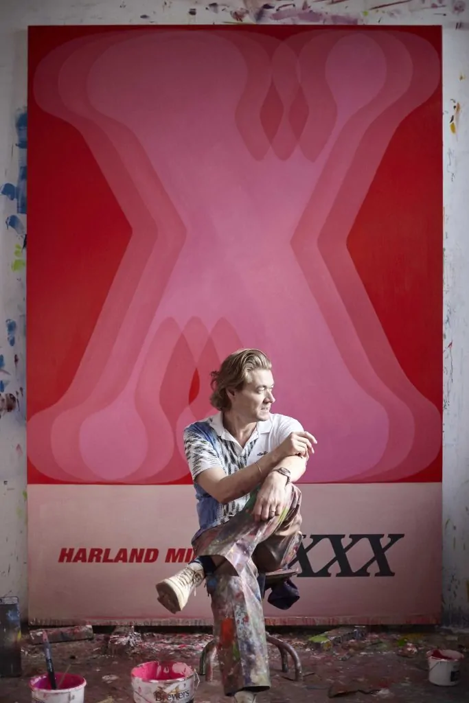
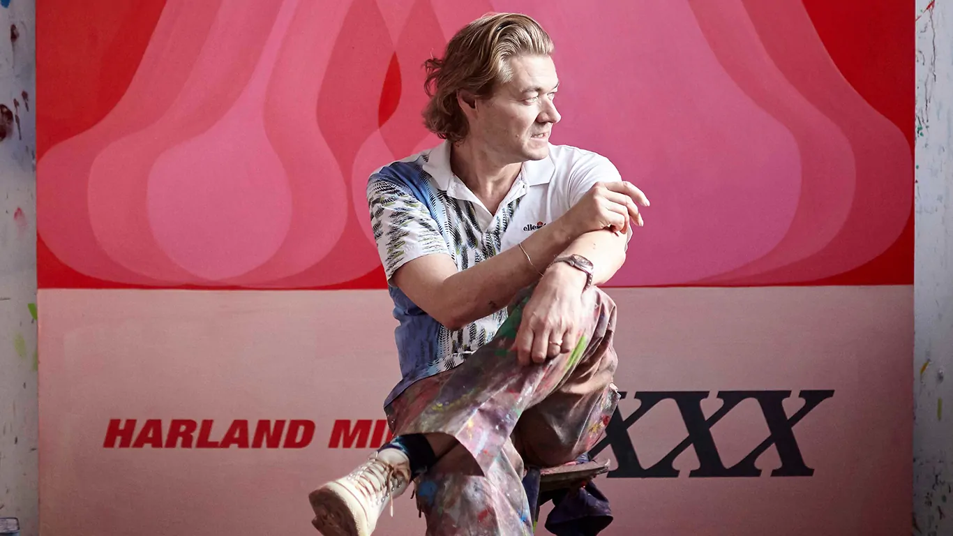
Courtesy White Cube
(Ollie Hammick)
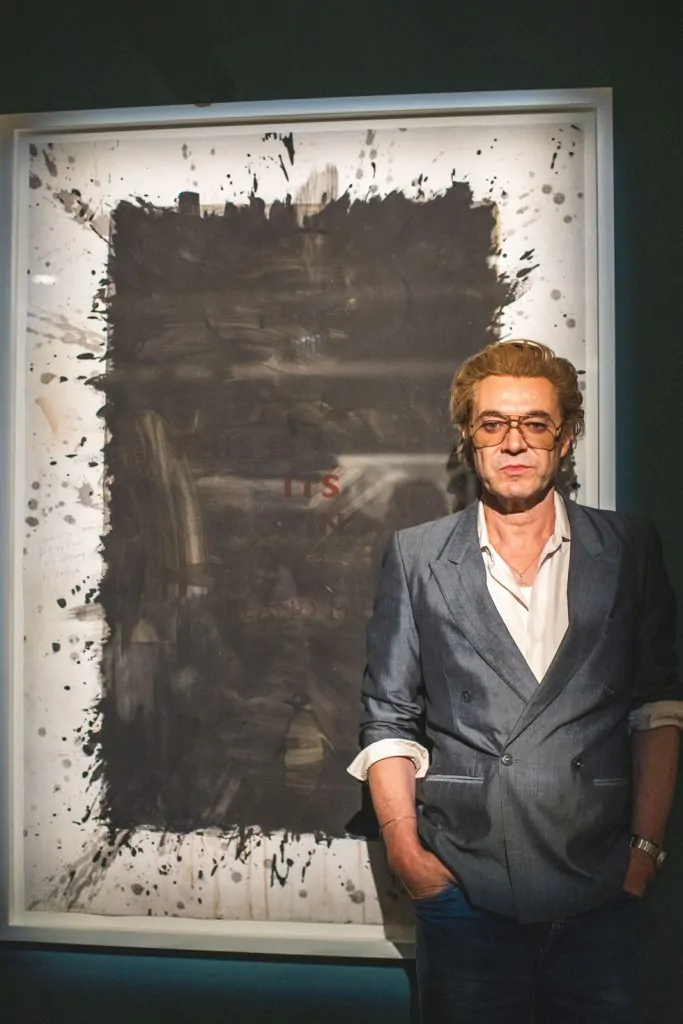
I’d say I’m a painter who writes. I mean, that’s the way it would balance out—it’s just finding the time to do both, y’know
Harland Miller
If you judged Miller by his covers, you’d find an artist who translates the dark comedy of life into literature made visible in paint. His canvases bind irony and satire within the familiar skin of Penguin’s classic design, devised by Sir Allen Lane.
Miller’s phrases read like tragicomic mantras: confessions disguised as punchlines like The Me I Know Never Knew, Murder—We’ve All Done It, or Incurable Romantic Seeks Dirty Filthy Whore.
I’ve admired his work since the late 2000s, though the train of ownership always seemed to pull away just before I reached the platform. On my desk now sits a small framed Who Cares Wins (2015). At once talisman and tease, it embodies the pursuit of meaning in a world where truth often hides between words. What is spoken, and what is withheld, I’ve come to realise, can cut just as sharply as what is said.
That tension, between possession and interpretation, extends to Miller himself. Painter or writer? “I’ve always thought of myself as a painter who also writes,” he said recently, describing the messy overlap of canvases and typewriters, with paint stains carried from one medium to the other.
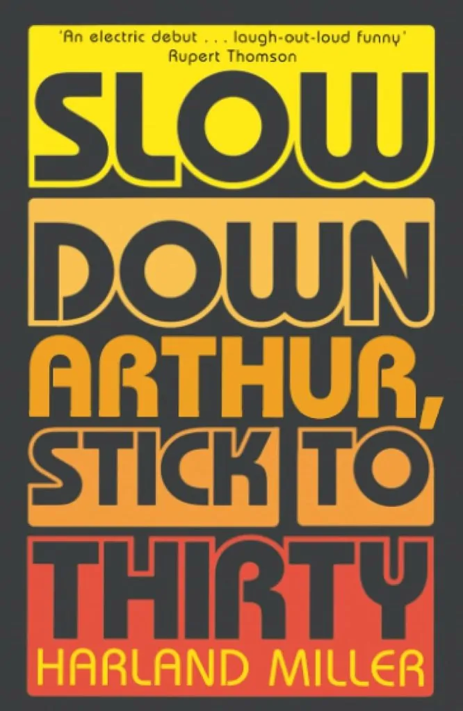
Yet his writing too often carries a painterly touch: layered, textural, and alive with colour, as in his 2000 debut novel Slow Down Arthur, Stick to Thirty, where Northern grit is rendered with the same mordant wit that animates his canvases. It is a novel so vivid it feels only a matter of time before it finds its way to the screen.
Born in Yorkshire in 1964, Miller grew up in the industrial shadow of the North, where humour was currency and acerbity a means of survival. Books were his passage out, and you can still hear that inflection in his titles. They collapse the distance between literature and autobiography: diary entries polished into one-liners, or one-liners cracked open to reveal a diary. His washes of bruised colour and simulated wear give them a lived-in intimacy, as if they had passed through many hands before arriving in ours.
Failure, uncertainty, experience, or their parody, has always stalked Miller’s work. Those now-iconic covers began in doubt. One night in Paris, confronted with a stack of discarded English paperbacks, he painted over a pulp novel about a cowboy named Ramrod. He buried the book beneath slabs of orange paint, then added his own text in Penguin’s typeface. “Was it even a painting?” he recalls. “I couldn’t tell. But that was what was exciting.” In that moment, doubt became his medium.
It is there, in doubt, in risk, in the slippage between word and image, that one glimpses the beauty of what it means to be an artist.
In recent years, Miller has widened his practice beyond Penguin homages, experimenting with abstraction and figuration, as well as graphically vernacular works that overlay letterforms until text itself becomes image. Still, the pulse of his work remains the same: a faith in language.
Many arrange words on covers; Miller makes them stare back with the sting of truth, footnotes to the human condition, heavier than the paint that carries them.
To stand before a Harland Miller canvas is to feel both seen and implicated. You look at the title. You laugh, perhaps again. Then you stop, stare. The joke has turned inward. In the end, it is about you.
You’ve often blurred the line between literature and visual art. Do you consider yourself more a writer who paints, or a painter who writes?
Harland Miller: I’d say I’m a painter who writes. I mean, that’s the way it would balance out—it’s just finding the time to do both, y’know. I’ve got more adept at it over the years: painting, then going directly to the typewriter—paint on my fingers, paint on the keys—and yet, all told, I’ve still only managed—what? A couple of novels, and one of those is a novella! There is a collection of short stories in the works. It’s titled Here Comes Heartache, Sixteen Coaches Long—it’s sixteen stories about heartache—which, to keep the train metaphor going, is… delayed. Due in a sense to a missing carriage! There are only fifteen stories at present—and Here Comes Heartache, Fifteen Coaches Long just didn’t scan as well as Sixteen.
Beyond that, there’s been a few essays and reviews, and I’ve also conducted a few interviews, actually—so in a sense I’ve sat where you’re sitting, Len, and I’ve asked people questions that I thought were pretty good questions… that they didn’t really answer—so I know that frustration you must have felt… which, by the way, you can expect a lot more of during this interview! [laughs]
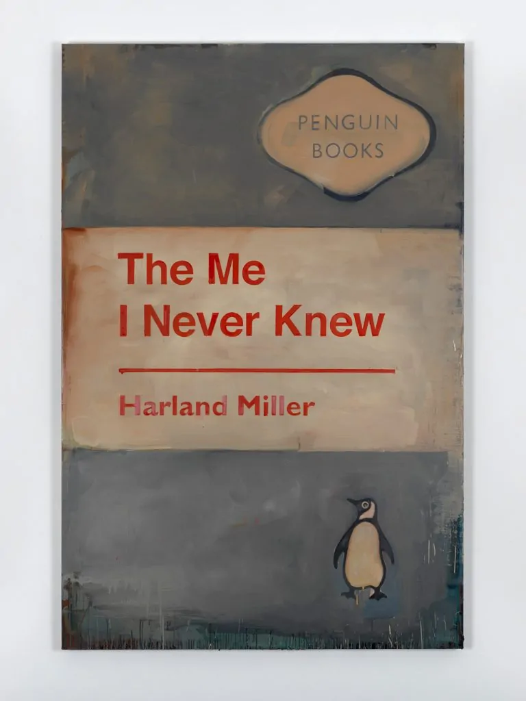
The Me I Never Knew
2009
Oil on canvas
92 15/16 x 62 3/16 x 2 3/16 in. | (236 x 158 x 5.5 cm)
© Harland Miller. Photo © Todd-White Art Photography. Courtesy White Cube
But back to your question—it’s relevant, as I’ve just written a memoir, and a lot of that’s about painting… or about trying to get into a situation where I could paint… which often seemed impossible… and now I’m trying to get into a situation in which I can write about trying to paint!
What also seems impossible right now is to publish it. Memoirs are easy to write, hard to publish—as people remember things differently. It’s just sitting on my desk right now gathering dust. I’ve even started to use it for other things: jotting down phone numbers, memos, thoughts, cups-without-saucers… and there’s a series of interlocking coffee rings on the title page now, which kind of makes you think of the Olympics—or, in this case, more like Olympic failure… or not even failure, just non-contention—fading out.
I mean, the coffee rings look like some sort of symbol… maybe like a race that’s already been run—and lost. Like, what’s that saying? When ‘your race is almost run’? Comparing life to a race—it’s such a depressing simile. A race to where—death?
Suffice to say, that won’t be the cover of my memoir. The memoir’s titled after a painting: ONE BAR ELECTRIC MEMOIR—and that’ll be the cover. The painting will be the cover.
by Harland Miller
Slow Down Arthur, Stick to Thirty introduced you as a novelist. Do you see that book and your visual art practice as part of the same narrative thread?
Harland Miller: Yes, that was a thinly veiled biography, so a lot of it was about how the imagery and language I use came about. The paintings are the results of those very things—but also suggestive, I think, of the narrative that’s led up to them.
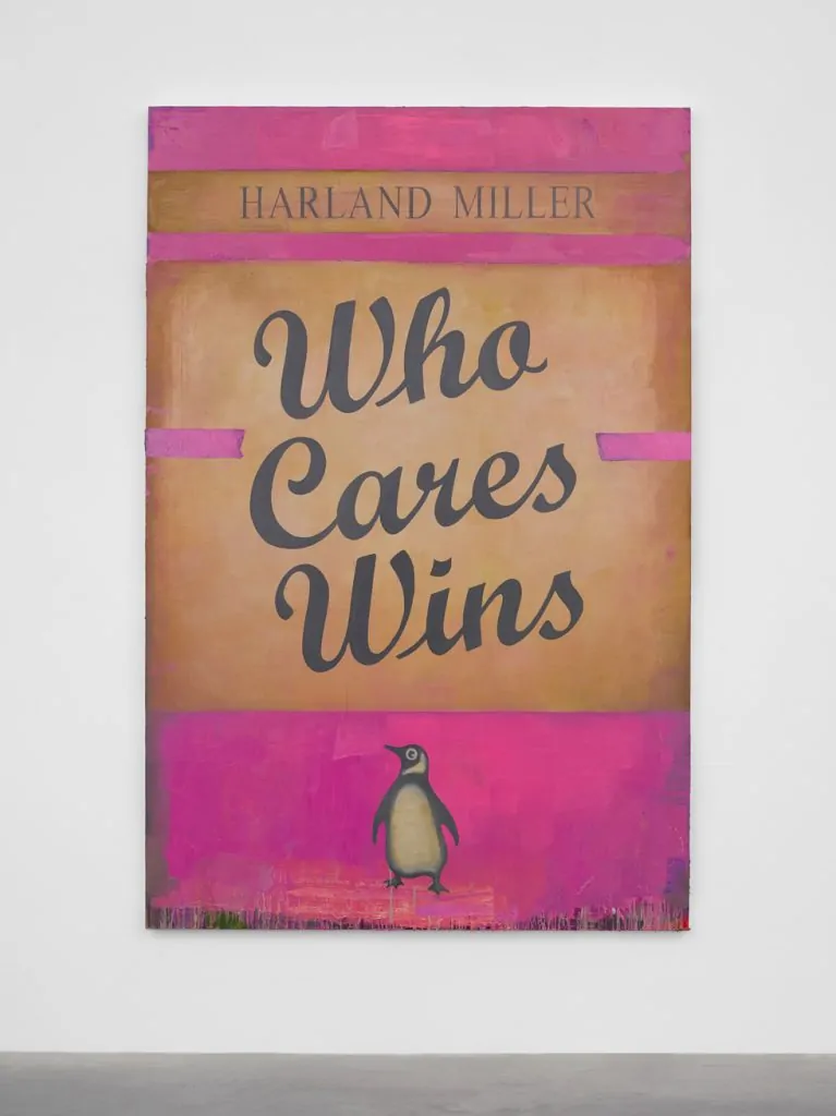
Who Cares Wins
2018
Oil on canvas
94 1/8 x 62 3/16 in. | (239 x 158 cm)
© Harland Miller. Photo © White Cube (Ollie Hammick).
Your Penguin book cover paintings have become iconic. What drew you to reimagine such a specific literary form, and what does it allow you to express that other formats don’t?
Harland Miller: If there’s something specific in your work, people who are interested always want to know how that came about… and books are quite specific, in a way that pure abstraction isn’t, really.
I’ve spoken about it before—enough times, anyway, for me to wonder if there wasn’t something I’d missed—but I always end up back in the same place. Looked at as a memory, it’s a sales room in Leeds where my dad’s bidding on tea chests of old second-hand books. You’d usually reckon to get one for about a fiver—I doubt you could get the tea chest for that now.
Only hitch, though—you never knew what you were getting. Back home, my dad would reach into the chest, carefully take out the first book… always dreaming of finding a first edition. He never did, but his facial expressions would always go through the same stages of concentration—like a gambler waiting for the play—transforming to doubt, and then ultimately, disappointment.
I mean, it wasn’t like losing big time at Cannes—less High-Roller, more Tombola! Actually, more like the disappointment of a Lucky Dip—if you remember those? You’d pay five pence and then plunge your whole forearm into a barrel of sawdust and search around till your fingers closed around something and then pull it out. It was usually a bar of soap.
And actually, what my dad found in these tea chests was in some ways the literary equivalent of soap: lots of romantic thrillers—Barbara Cartland, Mills & Boon, that kind of thing. There were some classic titles, but in mass market paperback.
After a while, and in frustration, he’d pick up the tea chest and empty the remaining books out all over the kitchen floor. He was quite a big bloke, and even after it was empty, he’d carry on shaking it till all that was coming out was a sprinkle of tea leaves.
I’ve always been superstitious—especially about tea leaves—but you couldn’t read much from this scatter of fine dust, apart from it didn’t point to a future fortune. My dad would kick the books around in his work boots and shout, ‘It’s all rubbish, Harland!’ But he never got rid of anything.
He was from that ‘Make Do and Mend’ generation, and he’d pay me a tanner to sweep up the tea leaves and sort the books into piles. As a kid I’d sort them according to kid’s logic—by what was on the covers. So, say, anything with a castle on it: it could be Dracula, a Scooby Doo annual, some serious medieval history, or something more recherché—someone having a torrid time in a dungeon.
All I can think is, this must have had some effect on me, because years later, instead of developing my own style, I was painting in many different ways—figuratively, expressively, photorealistically, abstractly—all simultaneously and with this mix of high and low culture.
While all that satisfied my feeling for painting—painting however I wanted to paint without restrictions—there was no consistency to it. When people would come to the studio, they’d think I was sharing it with other artists—but it was all my work!
All these disparate styles in a way were like the books I’d ordered into piles—they had something in common, which was the subject matter—but the cover expressed it in different ways. By introducing text into these paintings—text in the style of book titles—and by adding an author’s name (usually my own), that immediately brought all these different painting styles together under the umbrella of one idea: the book!
In its most popular form it fits easily into your hand, yet it’s the most radical repository of human thought ever invented. I’m not sure that’s true now—but it was when I began this series.
When I moved to Paris in 1990, I continued working with literature as source material—and naturally, the only books I found in Paris were in French… and not yet having enough French, I changed the titles for my own titles—titles I’d made up, which related to my life in Paris—and this reimagining became the part of the painting that I found both exciting and in some ways—therapeutic too.
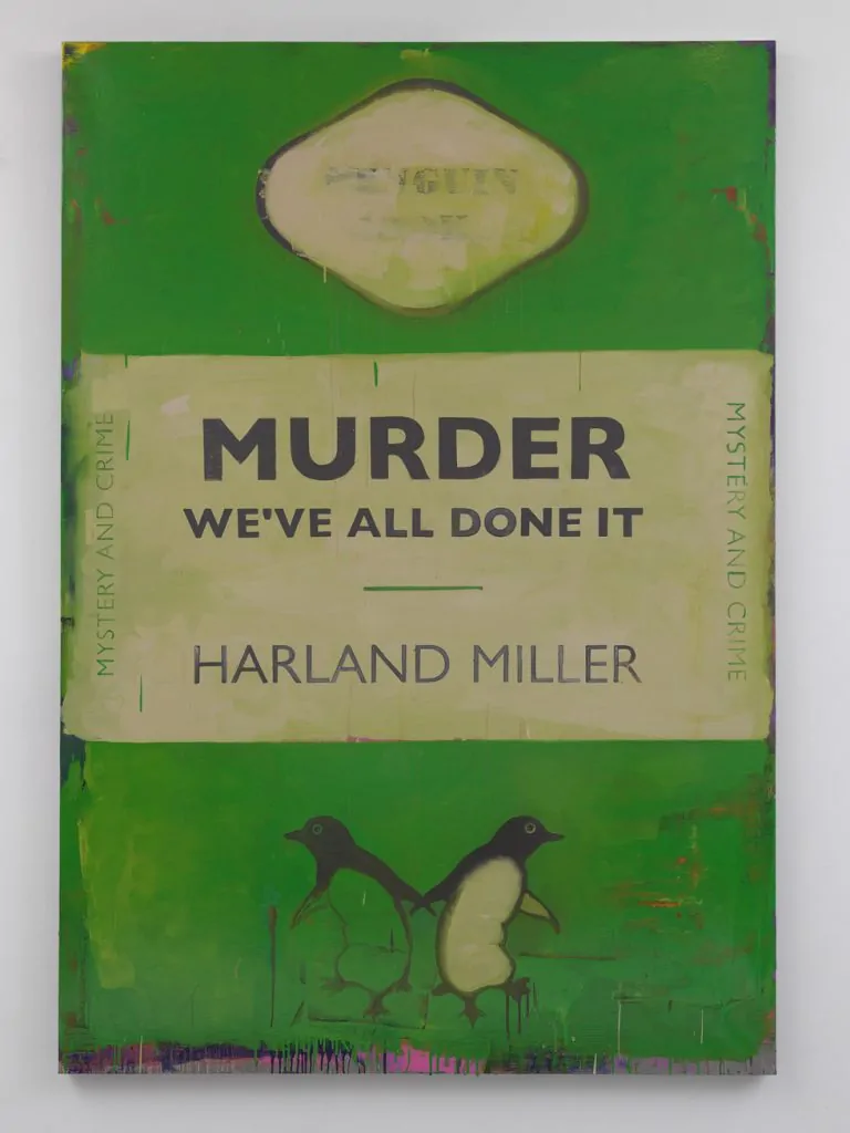
Murder – We’ve All Done It
2011
Oil on canvas
88 3/16 x 61 in. | (224 x 155 cm)
© Harland Miller. Photo © White Cube (Ben Westoby).
To the extent that painting the figurative elements became an almost onerous process I had to get through before painting the text, y’know—the words. As I said, at this time I didn’t speak French well enough to read it, so for actual reading matter I’d look for English-language books.
In Notre Dame I found a shop with a box of second-hand English books outside. I bought the whole box for ten francs, and, in an echo of my dad, when I got it back to the studio, I emptied them all out onto the floor… and what really jumped out at me were these Penguin classics!
I saw right away how the format threw all the focus onto the title, which is exactly what I wanted to do. They were all about the title—because apart from the colour coding (orange for fiction, blue for biographies, yellow for miscellaneous, green was crime, pink travel and adventure etc…)—that was the only difference between them: the colours!
I made the very first Penguin book painting that same night. I didn’t start a new canvas—I painted it over an existing book painting, one I’d been working on for months. It was a large painting of a cowboy called Ramrod. There were a whole series of Ramrod stories—this one was Ramrod Rides Out!
It sounds crazy to say so now, but it felt like a risky thing to do at the time. I mean, I was painting over a perfectly good Ramrod painting, for one thing. It was a very detailed image—I’d spent a while on it—and here I was, painting over it all, obliterating all that work with large, slapping swathes of orange.
But y’know, I felt that this idea of painting one of these very graphic and comparatively minimal Penguin book covers shouldn’t look or feel or be flat — like a book cover, or any printed matter — but that it should have texture to it, or behind it. Like its own history, like a book does after it’s been in the world for a while — which is a quality of second-hand books I love. Y’know, that used look and feel, and even that particular smell.
Anyway, what can I tell you — I worked on it into the night. I had a feeling about it that I wanted to hold onto. I wanted it to appear like the realisation of a sudden thought — and for that to have a consistency of freshness… and… well… it did! It did for me, anyway.
I’d worked on it intently and intensely. It was a large canvas, and there was the physical aspect of painting over the painting beneath — which I was doing in a very gestural way with, like I say, this large brush — then, the very different tempo of carefully painting in the text and the Penguin logo etc., what they call the graphic furniture, with a fine brush. When I eventually stepped back to look at it, I thought, Yeah! Looks good! I couldn’t see anything more to do to it — it looked finished, looked great! But was it even a painting, I wondered? I couldn’t tell. But that was what was exciting about it.
I know people have painted books before, of course. A few years later I saw R.B. Kitaj had painted a Pelican book back in the sixties. It was a nice painting, but it was just that — a painting of a Pelican book! Like a still life, really. Most probably it was a book Kitaj owned and had on his shelf. Perhaps the book meant something to him.
What I’d done was more subvert this well-known, well-loved imprint — and I realised, having done that, that the title — which visually was a relatively small part of the painting — became the largest part, in the sense of being its most defining factor. Because if it was just a painting of a Penguin book, like Kitaj’s, there’d be a sort of so what? feel about it.
Neither did the painting relate to a book’s dimensions — it just had the sense of being a painting based on a… on this Penguin design, which is a kind of phenomenon in publishing. I mean, a Penguin book — whatever it’s about, whoever wrote it — it has its own personality. This kind of perpetually kind of offbeat personality… it’s amazing!
Plus, how many book covers can you really recall? Clockwork Orange I remember, and there are others — but with the Penguin, you can see it in your head immediately, can’t you? It’s orange or green or whatever, but the panel in the middle is white with black writing, and that just jumps out… but it’s also balanced beautifully by the graphics in the coloured bands above and below.
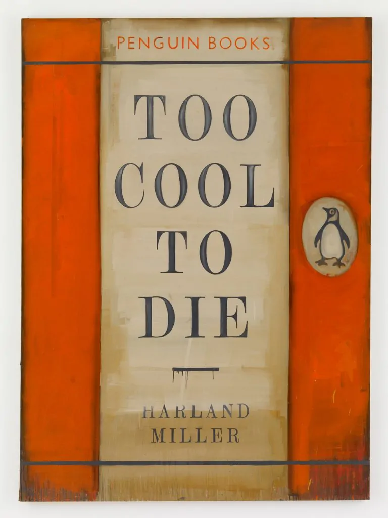
Too Cool To Die
2009
Oil on canvas
92 15/16 x 61 7/16 in. | (236 x 156 cm)
© Harland Miller. Photo © Stephen White. Courtesy White Cube
What I hadn’t realised was how much the coloured bands affected the way you read the text. In this case — the first one — it was this vibrant, but quite degraded and faded and dirty orange. That’s the most common colour, and because it was common, I hadn’t realised how impactful that would be on a large scale — how it affected you when you were standing in front of it as a giant book, as opposed to when you were just holding it in your hand. And like I said, the colour was really key to how you’d read the title too.
The orange gave it energy — orange does that. Hippies can explain it better — but it’s something to do with your energy chakra. And this is interesting, you know, because when you paint with orange, you tend to — or I’ve found I tend to — paint with it in a more energetic way, with this heavy kind of slashing brushwork, and that also contributes to how you interpret the title. And that first title was ‘I’m So Fucking Hard – Ernest Hemingway’ — so all that physical energy chakra stuff was all grist to the mill, really.
I mentioned scale just now and how important that was — because books are relatively small objects — but when you blow them up over people’s heads… I don’t mean intellectually, but according to scale… you create a physical presence that suggests some comment on the content of the book — the idea behind it.
I suppose I could have extrapolated these elements of text and colour and made a new series of paintings based on the way text fuses with the emotional impact of colour, but what I liked about appropriating the Penguin design was the way I was subverting something safe — or kind of anodyne, if that’s the word I want. Nobody would argue with a Penguin Classic — they’re like old pals, especially if you grew up in the UK in the 60s and 70s.
Whereas when they originally appeared — 90 years ago — they were pretty controversial. Because, y’know, they made the classics affordable, and suddenly the working classes had a means to educate themselves. You wouldn’t know it now, but back then, a really subversive thing to do was to educate yourself — and that was exemplified when the judge, in his summing up in the case against Lady Chatterley’s Lover, finished by saying: “Would you want your gardener to read this?”
There are many more aspects to this series, but I’m conscious that I’m an enthusiast and apt to go on… so, next question.
Many of your invented titles—such as Happiness: The Case Against—toe the line between humour and melancholy. How do you balance irony with sincerity in your work?
Harland Miller: I suppose—like much I find attributable—I can trace it back to my upbringing. There was a sense in Yorkshire in the ’70s that life was one big carnage; relieved here and there by humour or prayer or drinking—or all three. And I find I still think that way. I think and write that way. So, the titles are an extension or distillation of those disparate things… and because experience is so varied, other people relate to them that way too.
I’m not sure anybody looks at a painting of mine and thinks, “Hmm, this guy—what’s-his-name—Harland Miller… seems like he’s having a hard time with happiness!” After all, why should they? They don’t know me. What I think people do is make it personal—and I say that based on what people tell me, when they tell me about the work—what it means to them.
It seems like something they want to let me in on, and I’m blown away when that happens, to be so confided in by total strangers—like I’m a holy man or something… It’s really something that renews your faith in humanity… if it’s been eroded, that is.
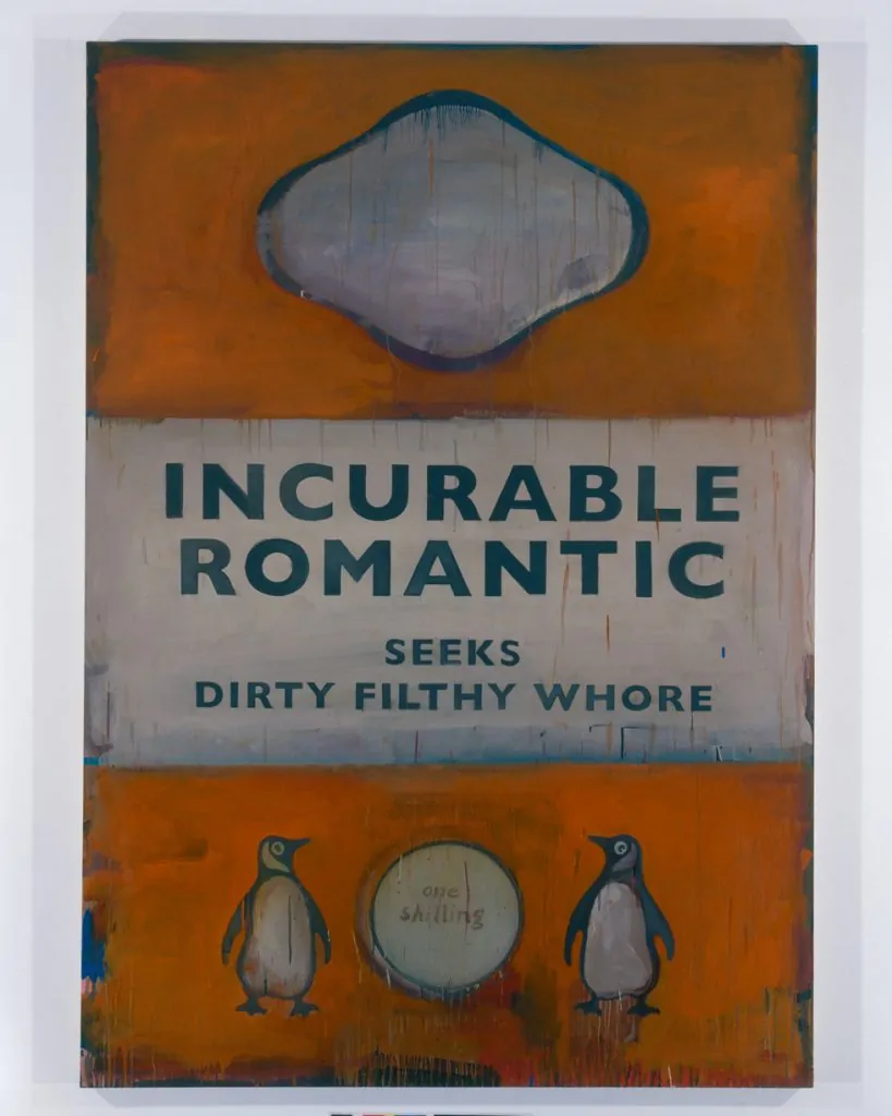
Incurable Romantic Seeks Dirty Filthy Whore 2007
Oil on canvas
83 7/8 x 61 in. | (213 x 155 cm)
© Harland Miller. Photo © Stephen White. Courtesy White Cube
Your name appears on your artworks as if you’re both the author and the fictional protagonist. What role does identity play in your practice?
Harland Miller: Yeah—so, identity in my work is… what is it? Okay, well, let’s say—for example—take the painting INTERNATIONAL LONELY GUY. That’s both—yeah—an identity that came to me when I was doing a lot of travelling, as a youngish man—hence the “guy” part—that bit’s very important.
I once did a talk at the Tate and was introduced as “The International Lonely Man!” It sounded so flat, and a bit tragic. It’s semantics; but “International Lonely Guy” has mystery. I guess I came up with it because if there was any mystery to what I was doing with my life at that time, it was the shrugging kind my parents would give if a neighbour asked them how I was getting on. “Mystery to me,” they’d likely say. And it was probably a mystery to me too! Some may call it bumming around, and it’s true, I wasn’t really based anywhere at that time.
I was either staying with friends or in a lot of impersonal—cheap—hotels. I’ve always kept—I don’t know if you’d call them journals exactly, but something of the kind—and I kept them pretty assiduously during this time too. These were written under the heading International Lonely Guy. They were detailing what was happening—or what wasn’t! How I was feeling in the moment—something I’ve always struggled with.
As writing, it was an elevation of the mundane. A hard‑boiled style without drama or plot. The journals themselves are in a drawer somewhere, but the title is out there on paintings—out there in the world—totally divorced from my experience of going it alone; and so, y’know, people make it their own, which is great. I alluded to this before; but again, I don’t think anyone really looks at this work—and thinks, “Hmm, what gives with this Harland Miller guy—all alone and out there in the world someplace—and just what is he doing exactly—why is he so lonely—what’s he done to merit that?” I really don’t think that’s how these paintings work.
I think people see themselves or their experience in the title; my name on the painting is immaterial—it just gives it visual balance and a kind of visual legitimacy. All books have authors, and people can defer the title to me if they don’t want to associate themselves with it directly. If you like, say… You Can Rely on Me—I’ll Always Let You Down… Harland Miller—if you like this, but it’s too close for comfort, you can just point with your thumb and say, “Not me! It’s this guy Harland Miller—he’s a real card.”
People have said, “Y’know, that’s me to a T, that is!”
One lady told me she’d thought to buy it for her husband, because he was always on the road. She understood it was his work; he loved what he did, he was good at it—they were lucky—but it was also hard. She said when he was away, the painting was there at home, this large physical presence which gave off this sympathetic persona—almost a totem of sorts.
That’s not the case for all the works, for sure; and I recall one person gasping in front of one of my paintings and clutching their face like they were the figure in Munch’s Scream. “My god,” they were saying, “such megalomania!” That particular person may not have gotten beyond their first reaction—but what was interesting was they were looking at a painting titled Narcissist Seeks Similar—Harland Miller.
And I mean, what kind of narcissist would put their name to that kind of self‑parody? In this case, it was me… so y’know, there’s the drama of that statement, shading into melodrama, undermining itself with sarcasm, irony, and humour—but sometimes people can’t get past their first reaction.
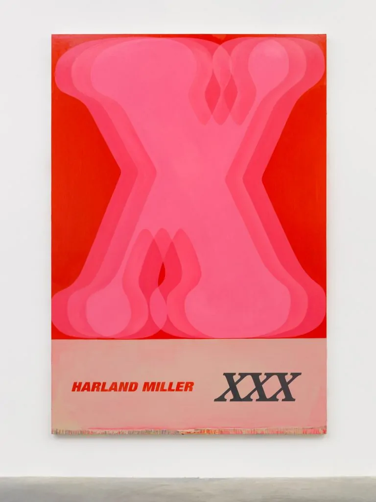
XXX
2019
Oil on canvas
104 1/8 x 71 13/16 in. | (264.4 x 182.4 cm)
105 | 1/8 x 72 13/16 x 2 1/2 in. | (267 x 185 x 6.4 cm) | (framed)
© Harland Miller. Photo © White Cube (Theo Christelis). Courtesy White Cube
In your “Letter Paintings”, you reduce language to single words or letters. What fascinates you about this minimal use of text, and how does it function differently from your Penguin work?
Harland Miller: I’d developed a certain approach to sentence structure, in which I’d always try to balance some of those things we’ve already spoken about—like the big themes—with the everyday ones. Like DEATH: What’s in it for me? It’s heavy, but there’s levity there too.
After a while of formulating sentences like that, I wanted to go the other way—see if I could make work that used as little language as possible. Or as poss, I should say. And see if that could still have the same power.
In this series, I’m relying on other aspects of the work to create the contradictions—like the composition, the colour, the scale. Naturally, I can’t do this with words when I’m using only one word—and a short one at that. But I’ve always loved words—not just for their sound or meaning, but for how they look. Words are iconic, and single words lend themselves much more to the idea of an icon or a form.
There’s a strong sense of nostalgia in your work—particularly for mid-20th-century graphic design. Are you engaging in critique, preservation, or something else entirely?
Harland Miller: You know, I was looking at these kinds of psychotherapy books from the post‑war era—’50s, ’60s, even the ’70s. What they shared was a kind of optimism—a sense that the future could be rebuilt better. And a lot of that optimism was reflected on the covers—in the use of bright colours. Colour, after the grey years of war, was a sign of vitality—an emblem of physical and mental well-being. And that robust vitality simplified—or belied—the complexity of the geometric designs that were so characteristic of those psychotherapy books at the time.
That’s what I was responding to. And though these paintings weren’t appropriations—they were my own designs—I was just taking that particular aesthetic as a starting point. I wanted to locate them in their rightful era, from whence, if you like, they came. And—y’know—I really liked the visual contradiction of looking back at a forward-looking image.
And the challenge, in painterly terms, of showing that sharp geometric imagery alongside the shabby patina they now have, over half a century later… and how to get these two disparate aesthetics to work together at the same time—describing, as they would, if you get it right, a passage of time. And a passage of time in which the edges have also definitely come off that previous optimism.
Love Saves the Day
2012
Oil on wood
63 x 41 3/4 x 2 15/16 in. | (160 x 106 x 7.5 cm)
© Harland Miller. Photo © White Cube (Ben Westoby).
Your work often repurposes familiar literary forms to convey personal or societal anxieties—do you see this as cultural preservation, critique, or a kind of self-therapy? And what responsibility do you think the artist has in reframing collective memory?
Harland Miller: …This is a tricky—what? Three, four, five-part question, Len! Not one I can give a definitive answer to, but let’s see…
Somebody—I can’t remember who—once said, “It’s hard to think of one painting or one work of art that made men act in a more just way to one another. Books maybe, but a work of art—no!” I suppose in one or two ways, by making a painting of a book, I was challenging that view. Of course, a painting of a book is not a book either—so I was also undermining my own concept, with titles like IMMEDIATE RELIEF—Coming Soon, or THE FUTURE: You May Not Like It Now, But You Will.
I think these kinds of titles convey both personal and societal anxieties. And sorry to sound like a stuck record, but I’m saying this based on what people have actually said to me about the work—sometimes in surprising ways.
Let’s say being gay is still—unbelievably—associated with personal and societal anxiety. A really cool young guy at one of my book signings once leaned over the desk at which I sat, signing his book—and, lowering his voice, told me that he and his same-sex partner had memorised all my titles. Something even I haven’t done! He explained that being gay was a real no-no in both their respective families.
So, when they were with either of their families, and wanted to tell one another how they felt, they’d speak about my work instead. The way this worked was that the titles they’d memorised were all codified. Each one had a secret meaning—like Who Cares Wins, which was code for “I love you!” And so on. He had many more examples.
He may have thought from my reaction that I wasn’t particularly interested in what he was telling me—whereas I was actually mesmerised. Totally blown away. What I really loved was that the work was actually—actually—out there doing something in the world, y’know? My painting was being used as secret combat against being gay.
After that brief but mesmerising interaction, I brought that idea forward into the texts themselves. So, for instance: THIS PAINTING BANS DEVILS… THIS PAINTING SUCKS MEANING OUT OF THE ROOM… THIS PAINTING WILL KICK IN WHEN THE TIME COMES…
And to the last part of your question—I don’t know if that answers the first part—but to the last: what responsibility do I think the artist has in reframing collective memory? Hmmm… I’d say—I don’t know about that. It’s not something I’d want to embark on myself.
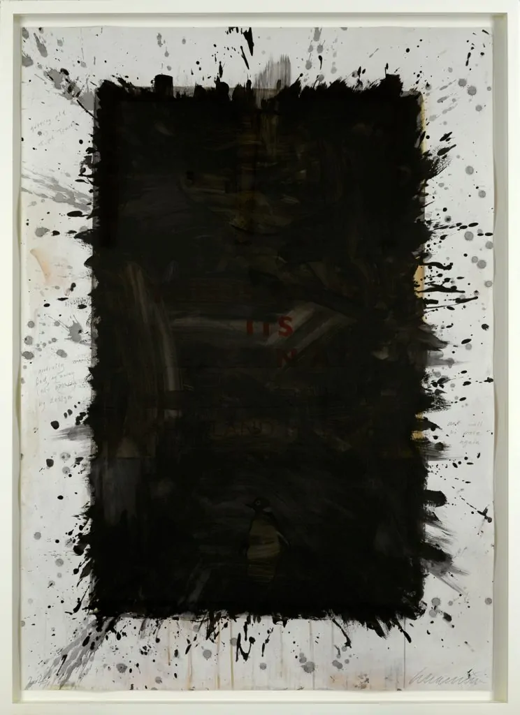
Gradually fading away into nothing by design (2025)
Original screenprint in colour from 2012
overpainted by hand in seaweed ink
Unique work 153.5 cm x 110 cm
You recently took part in Art for Your Oceans at Sotheby’s with your seaweed-ink piece Gradually Fading Away Into Nothing by Design. What inspired the work, and what was it like using such an unconventional material?
Harland Miller: I was asked by the World Wildlife Fund if I had any interest in seaweed. I love the sea—and seaweed by extension, I guess—so I said yes. I’d worked with them previously on Save the Tiger, but seaweed isn’t in danger. In fact, there’s loads of it—which is kind of the point.
In the UK, we’re surrounded by coast and seaweed, but we import seaweed from Japan! We do this because there’s only one seaweed processing plant in the whole of the UK, and that’s up in Scotland, on the Isle of Skye. The idea was to go up there with a group of potential investors and environmentalists and study seaweed for a couple of weeks—and then make some work about it.
At SAMS—the research centre in Skye—we were shown all the things you can do and make with seaweed. One of the marine scientists asked me what, as an artist, I was going to do. How was I going to make some art that would advocate seaweed to the wider world—or to an environmentally engaged part of the art world?
There was a photographer and a journalist there, and it was easy to see what they’d do—they’d write a piece, it would get published with photographs. But the scientist seemed uncertain as to what I, as a painter, was going to do.
So was I, actually.
Gradually fading away into nothing by design (2025)
Credit Dreaming Fish Productions – Sian Herbert – WWF-UK
But one of the products he’d shown us, that could be made from seaweed, was ink—seaweed ink! All in an array of beautiful, seaweedy colours. And I said I’d probably make a piece of work—not illustrating seaweed, but something like I’d do anyway. Something more abstract, say, using the ink.
We then talked about the ink, and he enthused about its properties—of which there are many. You can make a whole lot of ink out of just a small amount of seaweed. It’s cheap. It’s natural. It won’t harm you if you get it on your skin—in fact, it’s a beauty product, so you might come out of your studio looking better than when you went in. Which is a rare occurrence…
He finished by saying, “The only thing was—it dinnae last.”
“No?” I said, a little concerned.
“No,” he said, and went on to talk about all the packaging we deal with every day—all the boxes that arrive at our doors daily. “They’re all printed with ink that’ll last a thousand years—and it doesn’t need to. It’s all going to be thrown out, and as landfill, it poisons the soil.”
I said that was terrific—as far as packaging you chuck out. But if I was going to make an art piece out of it—and sell it for thousands—it had to last for a little while. A thousand years would be good, for starters.
I should add: if you use a little binder or fixer with seaweed ink, then yes, it’ll last as long as regular ink. But I’d immediately felt there was something about the ink fading that was germane to the environmental aims of the charity—and that if I could introduce that into the art somehow, conceptually, that would be great.
Originally, I thought in terms of a text-based work that would gradually fade away—and that the text should explain the nature of the work. So I came up with:
GRADUALLY FADING AWAY INTO NOTHING BY DESIGN—black ink on white paper.
Which was cool as far as it went—but eventually, you’d end up with a blank piece of paper on your wall, albeit framed. Even though buying the work would give the collector a kind of feel-good factor—having done something to benefit the environment—unless they were minimalists, there wouldn’t be much left for them.
So I thought a bit further, and came up with the idea of painting over one of my most sought-after prints:
THIS IS WHERE IT’S FUCKING AT (AT LEAST IT USED TO BE)
Painting it all out.
I only have a few proofs of this left, but I thought—well, y’know—someone might be looking for this print for years. And if they buy this one now, they’ll have it both now and in the future—because by the time the ink fades, that might represent the time they’d have spent searching for the print anyway.
I did actually meet a collector who told me they’d been looking for that piece for over ten years. So… it’s based on an idea of waiting and watching. And out of the edition, this one is certainly the most unique.
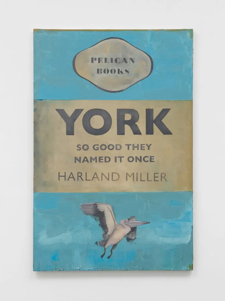
York So Good They Named It Once
2024
Oil on canvas
93 1/8 x 61 13/16 in. | (236.5 x 157 cm)
© Harland Miller. Photo © White Cube (David Westwood).
In an age where art is increasingly shaped by algorithms and speed, how do you view the role of the artist who works slowly—with language, with memory, with paint?
Harland Miller: Hmm. How do I view the role of the artist who works slowly—with language, memory, paint…?
I think, as that side of things continues to accelerate—creating more and more of it—any work, particularly paintings, that are made up of layers… paintings in which there are mistakes and doubt, paintings where there’s visible discussion and experimentation going on—on the canvas itself, played out by a human hand—I think that work will stand out.
And if you’re also talking about AI—well, who knows what that will be capable of in the future? As soon as you put my reservations online, Len, AI will have access to them and may begin addressing them. Who knows?
However, right now, a guy who does my layouts for me told me he’d asked AI to come up with a series of paintings in the style of Harland Miller…
“Really?” I said. “And…?”
“Well, let’s see,” he said. “It doesn’t take long.”
“Okay,” I said—and he was right. It really wasn’t long after he prompted AI that we were looking at the results.
I’m happy to say they weren’t very good. I mean, they looked okay-ish at a glance—if you didn’t know better—but the language… that was where it let itself down. The results were feeble at best.
Actually, the Penguin Book paintings that we spoke about earlier—that series is very ripped off these days. I don’t mind. A lot of people really do mind on my behalf—but actually, I don’t. I can’t recall who said it, but someone once said:
“I’d be worried if I wasn’t getting ripped off.”
Well—I’m gonna rip them off—whoever they are—and say the same thing.
Lastly, what is your underlying philosophy of art—what do you believe art should do, and how does that belief shape not only your work, but also the way you move through the world?
Harland Miller: Hmm. Okay. Well, when I catch myself philosophising… it’s like I wake up out of it. And the philosophy—such as it was—fades like a dream.
I don’t know…
My mother had a beautiful singing voice. We were brought up Methodist. On the coast, there was a lot of Methodism, which seemed to be mostly about catching fish—which is how people lived. And my mother—she used to sing in Chapel every Sunday morning. That was until she got asthma and could no longer reach the high notes. She’d try, and her voice would crack, and that was really heartbreaking to hear.
But as a kid in a back pew, it also used to bring me out of this kind of trance-like state. Looking back, I realise now it was probably a very early form of a natural kind of philosophising—the kind of space the chapel allowed me to enter into.
The hymns were all about the sea as a metaphor for death. There was one: “Will Your Anchor Hold in the Storms of Life”—and my favourite:
“Let There Be No Wailing at the Bar When I Put Out to Sea.”
As a kid, I didn’t realise that “the bar” referred to the threshold between life and death. I understood it only as the bar of a pub. The local pub on the quayside was called The Cod and Lobster, and the image this created was of a man vigorously rowing out to sea, having welched on a round of drinks—and leaving behind a lot of disconsolate drinkers, all wailing in a way that expressed their displeasure.
So what I took from that—apart from: never welch on a round of drinks—was a love of the combination between a practical approach toward what you do and the evocation of mystery that informs it.
It’s not exactly a rock-solid philosophy.
Usually, the last question in an interview is something quite jejune, something that reconnects you to the world. To carry on the theme, though—it’s a little like… I don’t know if you ever dive—but it’s a little like adjusting to the surface after a free dive. And in a way, that does kind of reconnect to my underlying philosophy of art—which is that, as well as the above, it should also be a free activity. Free as in uninhibited by anything.
Within that freedom, you’re free, of course, to choose bondage.
I’m speaking in this illusory way, Len, because—as I sort of said—I don’t think I have a really hard-and-fast philosophy. I love philosophy—and reading the manifestos of others: the injunctions to live or die—from Socrates’s “unexamined life is not worth living” to Wham’s “Make the most of every day, don’t let hard times stand in your way.”
But there’s no real Gospel according to Harland Miller.
©2025 Harland Miller
Contributing writer chronicling contemporary art’s beautiful mess — when he can get there. Survives on openings, opinions, one gallery, one artwork at a time. Considers espresso a meal.